Logo and design for a renovation campaign
410 Campaign is an ongoing campaign aimed at providing much needed building renovations for a local church, to support growth and outreach opportunities. As this campaign will be crucial for the functionality and mission of the church, it was important to design graphics that accurately captured the goals and hopes of this project. In order to best present the vision and direction behind it to stakeholders, I designed a simple yet compelling logo and accompanying slide deck and handout that would help the campaign gain momentum and support. These embody the idea of transparency, simplicity and collaboration.
The logo is loosely based on the visual components of the church building’s structure itself, with an open, three-dimensional icon that visually opens up the building, reaches in and improves/adds to the existing elements. I chose an iconographic style for the logo, which can easily be used in any application for the duration of the campaign.
Green represents future growth projected as a result of this campaign while all other colors are kept neutral to avoid distracting from the exciting changes taking place.

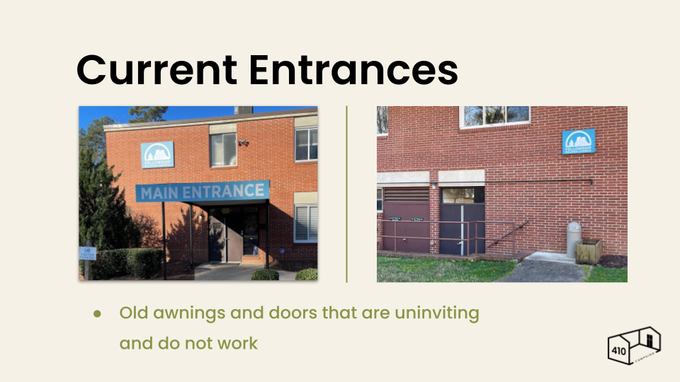
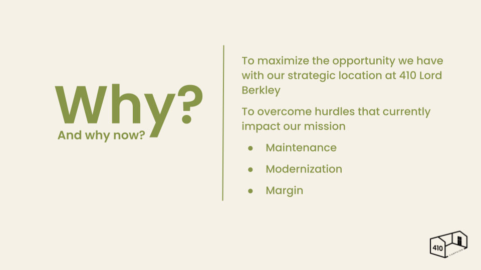
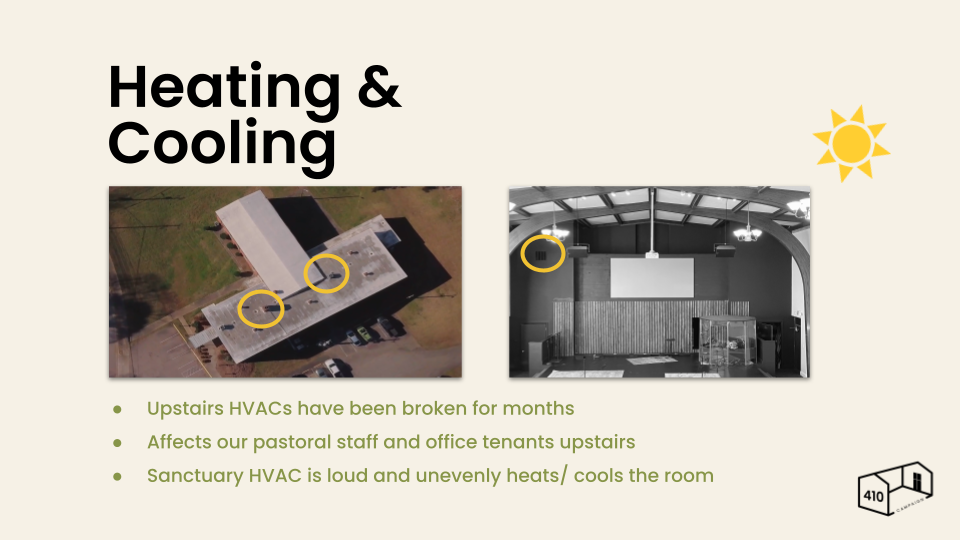
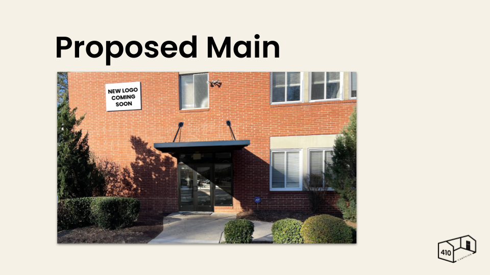
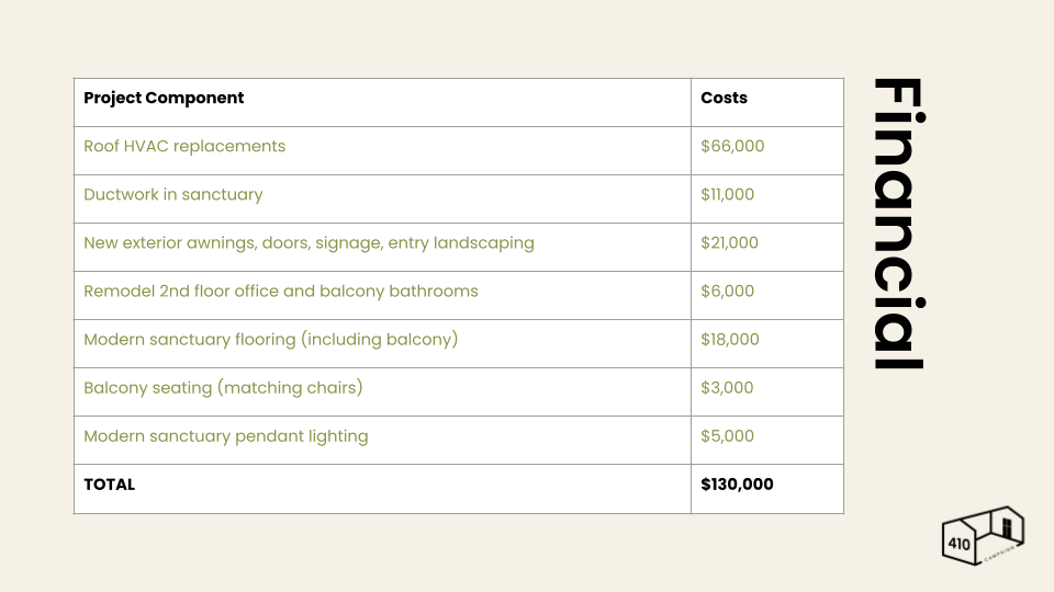
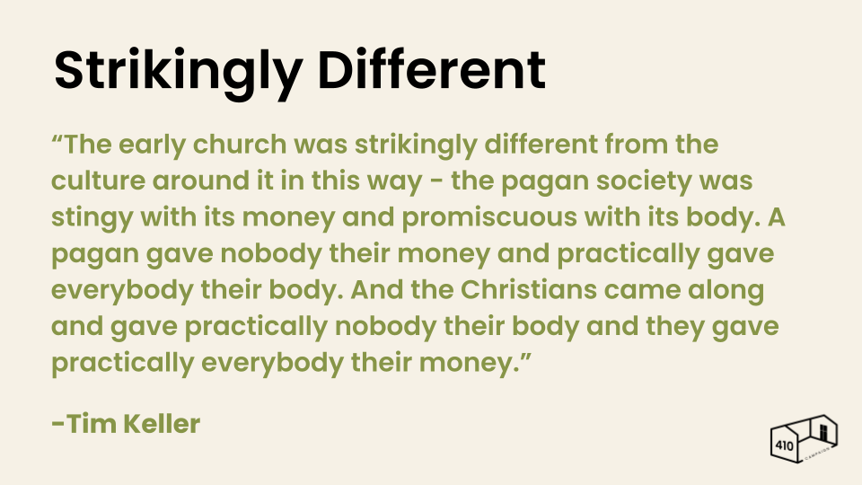
Along with the slide deck presentation (sample slides above), I also created a handout as a visual aid and summary of the campaign for stakeholders, church members and board members to have to refer to.
It succinctly captured the main points of the presentation and helped the participants visualize the project scope.


