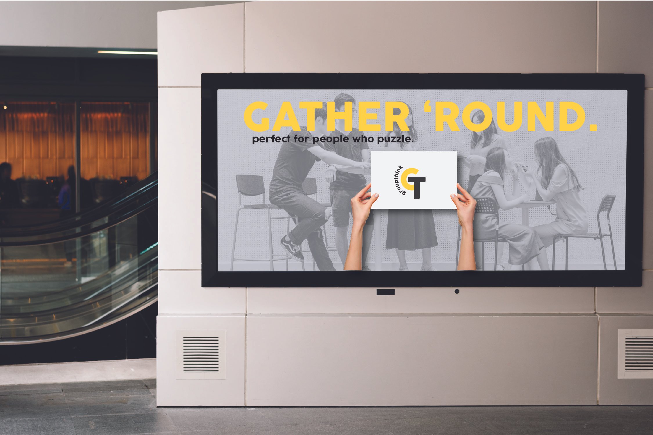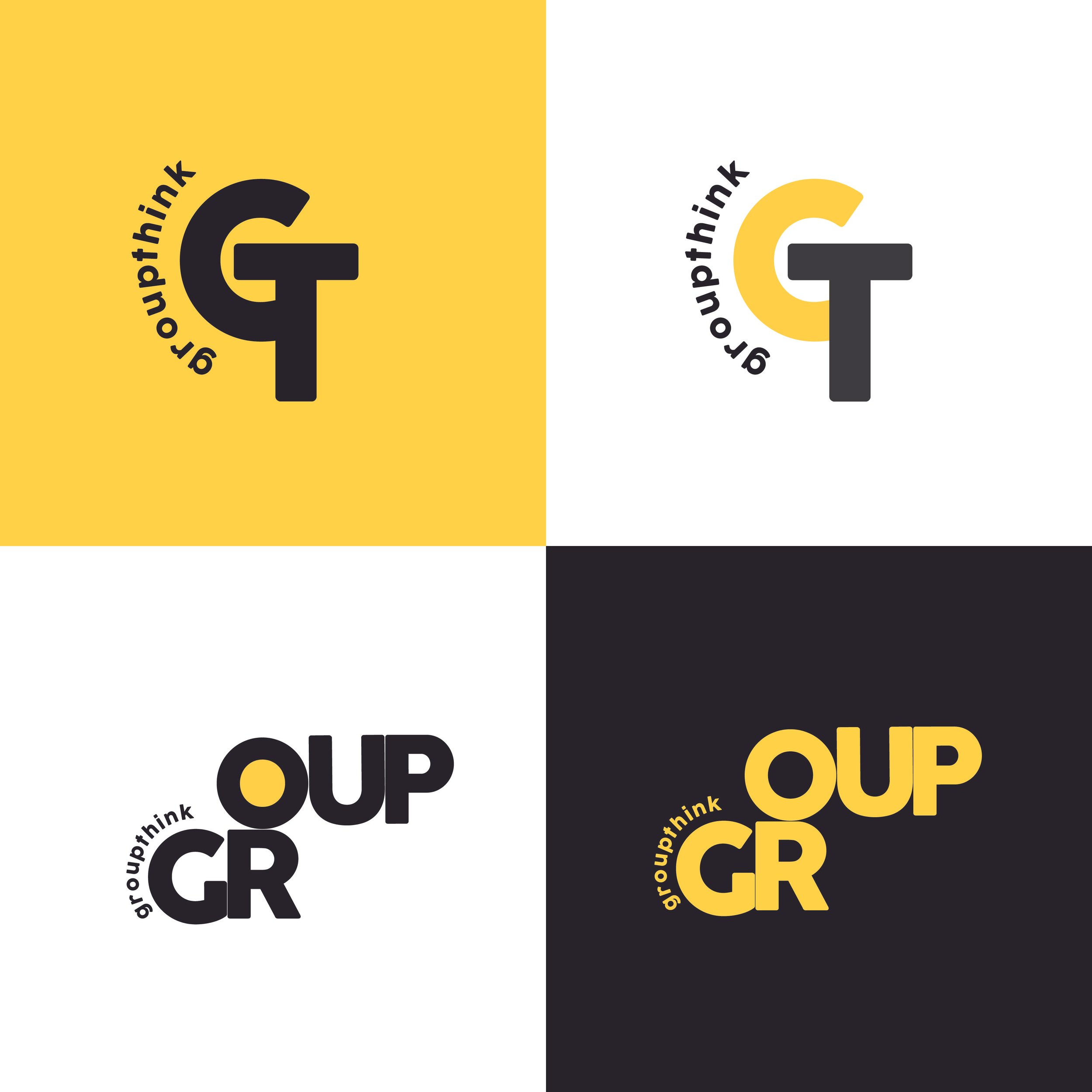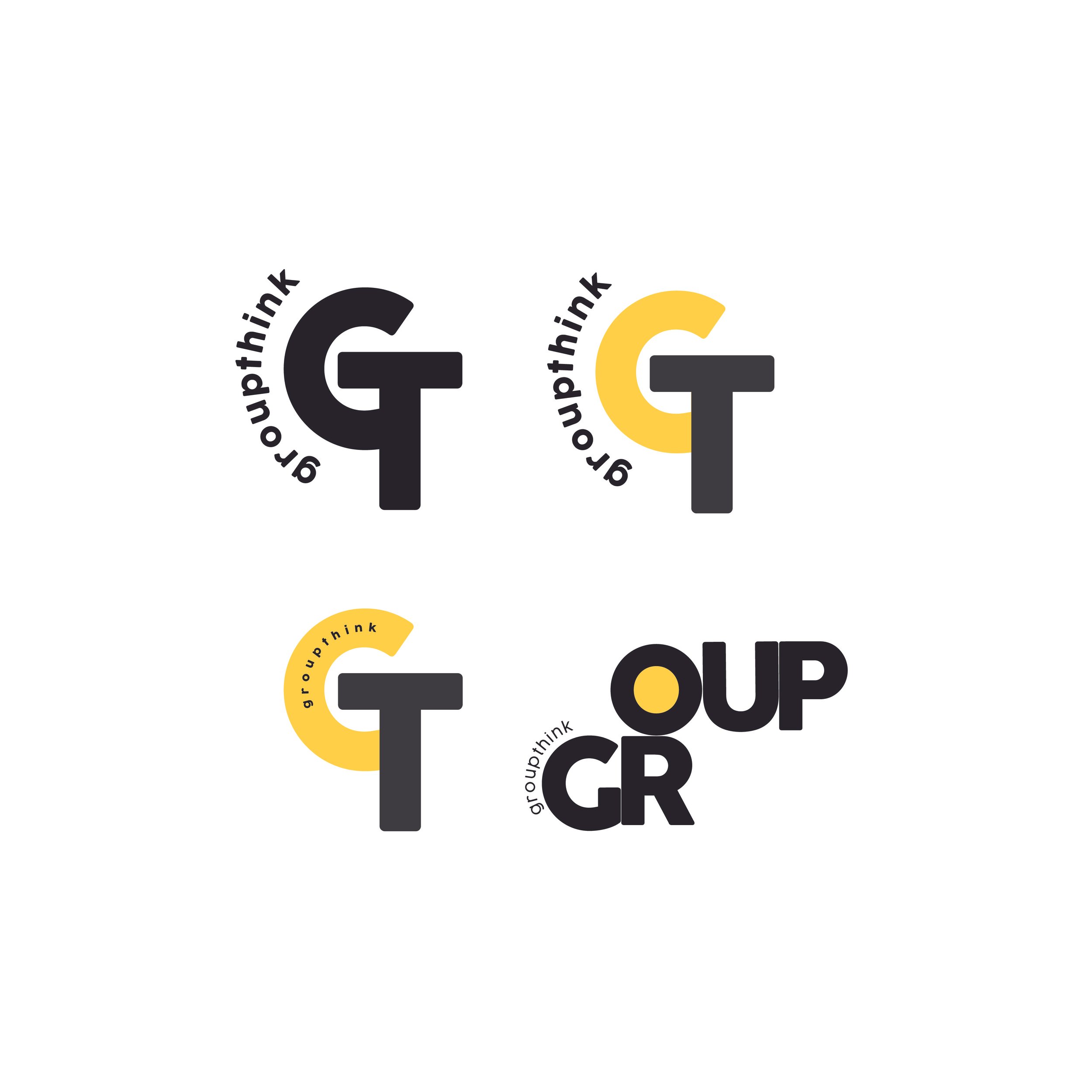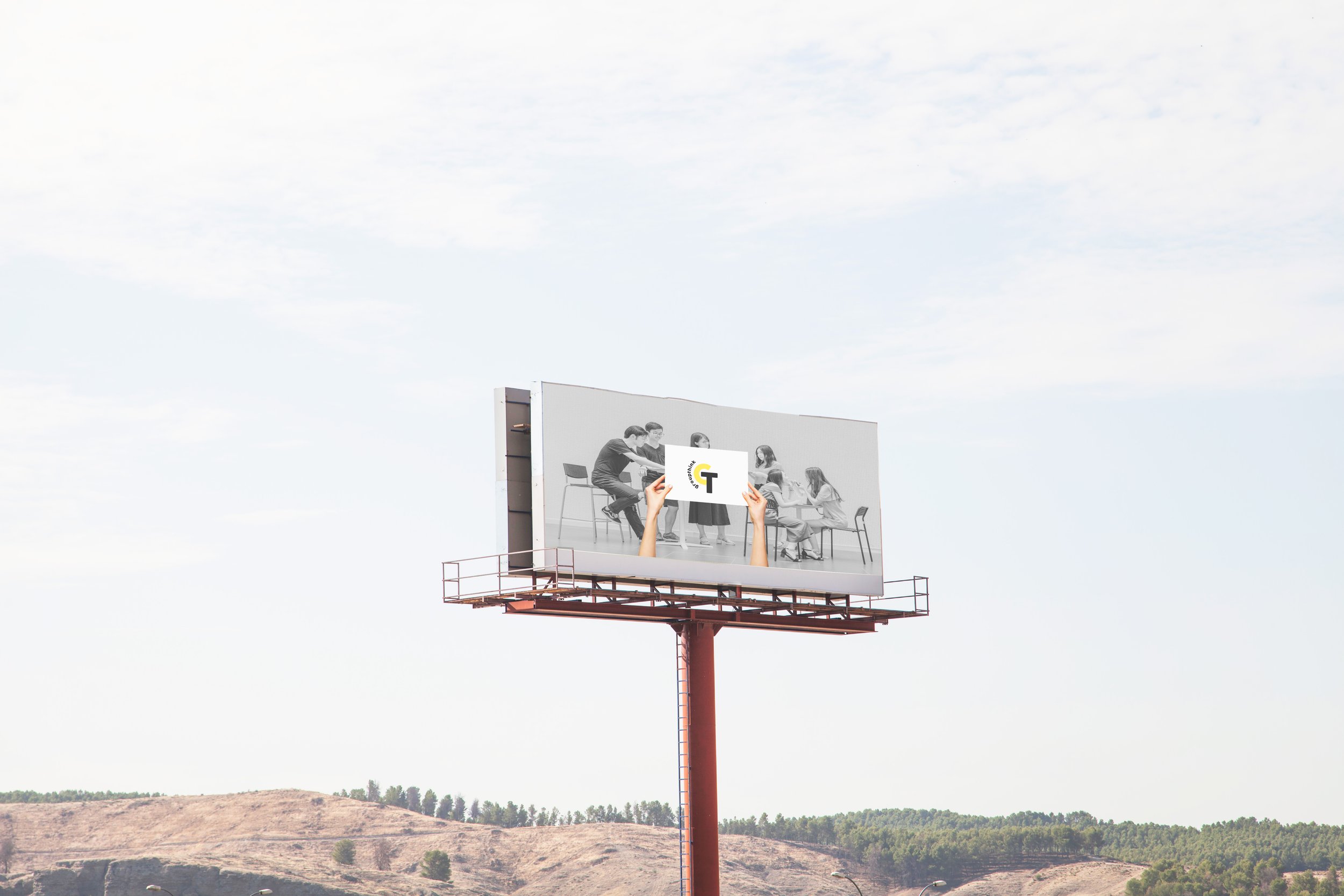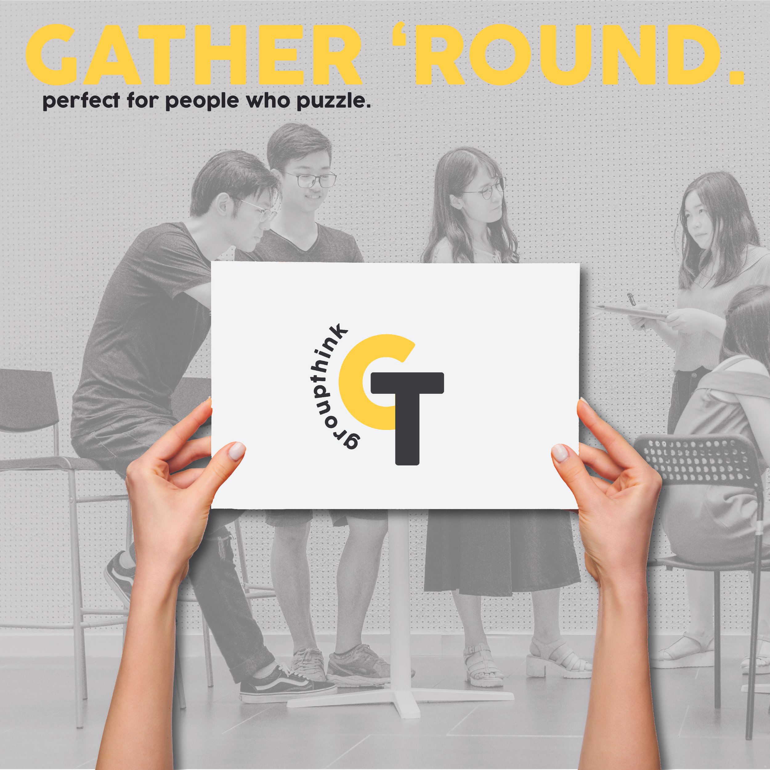
Branding for a collaborative workplace word game
What's better than a shared activity and common goal to bring people together? Introducing Groupthink. Without divulging too much information, the idea behind Groupthink was first formed by my client, which I then expanded upon in this branding exercise. Groupthink is a collaborative word game designed for the workplace, and intended to bring people together in a context where work is usually the priority. A fresh new take on a classic game, it is not yet a fully realized product, which posed an interesting challenge for me as I designed the logo prototypes.
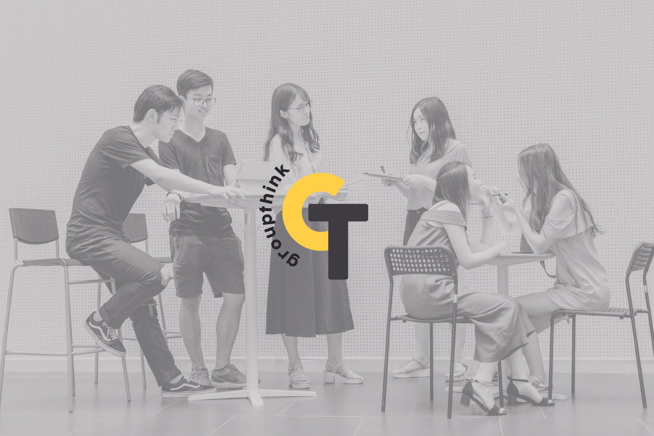
I wanted Groupthink to evoke the familiarity of the crossword motif. I stuck to a clean black and white color palette with yellow to indicate energy and give a nod to the classic highlighter color familiar in workplace settings. The logo itself plays with letter orientation and the constraints of an invisible grid, while the sublogo subtly and playfully combines the "G" and "T". Just as a crossword can be viewed from different directions, the logo imagines the name reoriented while still being legible. I wanted Groupthink to have a logical, brain game feel, with an emphasis on the letters themselves. Visually it appeals to word game lovers and represents the originality and out-of-the-box thinking of the brand.