Logo and branding for an annual conference
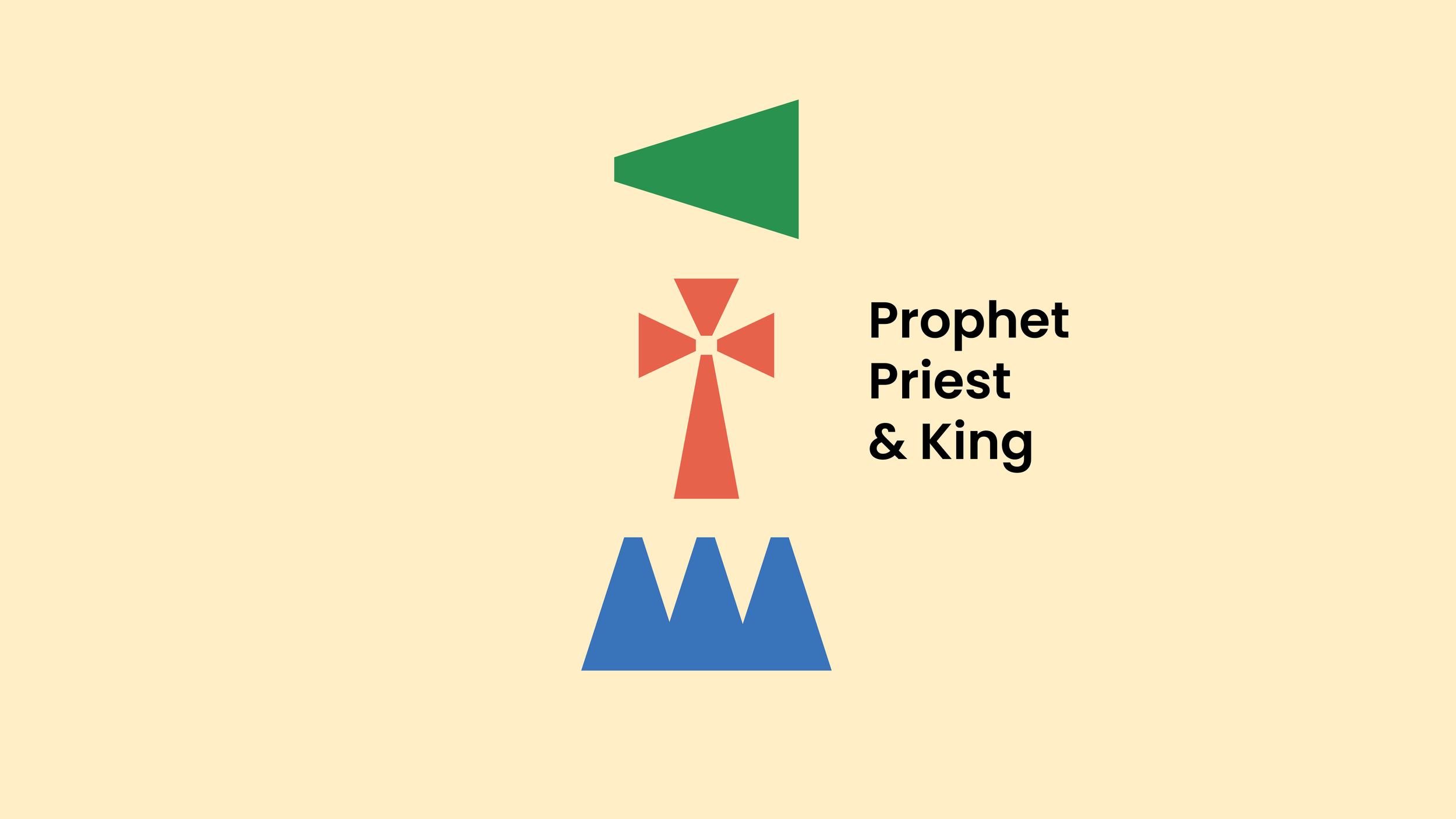
Every year the Mid-Atlantic Chinese Christian Conference is hosted under a new theme which requires fresh branding. The concept and design for this brand stemmed from the three major roles or “offices” that Jesus occupied in Scripture. Capturing the essence of this year’s theme, “Prophet, Priest & King” in a refreshing, modern way was a unique challenge for me.


For the color palette, green represents growth and newness, as prophets were meant to proclaim news and events to come. The red represents the blood shed by priests as they sacrificed animals in the temple, and ultimately by Jesus on the cross. Finally, the blue symbolizes royalty and the kingdom of heaven.
Process.
The idea for three distinct icons formed from a single shape was the basis for the logo. I wanted to represent each title as an abstract version of itself, while keeping them easily recognizable. After manipulating various shapes, the triangle seemed the most conducive to the angles of the three symbols: a megaphone (prophet), cross (priest) and crown (king).


